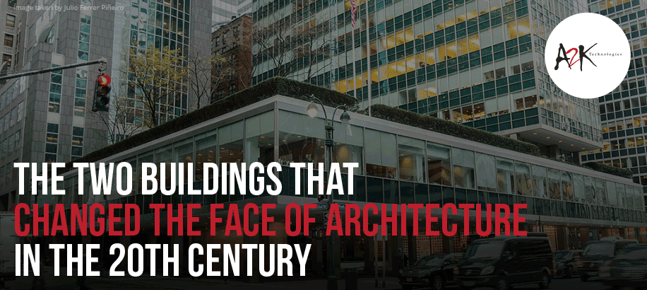
The two Buildings that changed the face of Architecture in the 20th Century
Written by Dexter Wallace l A2K Technologies
The Lever House and the Seagram building are the two buildings we are going to take a closer look at in this article. How they changed the face of architecture in the 20th century will be explained by analysing the form of the two buildings, its materials and its meanings. The two structures will be compared, and we will explain why we believe that these two buildings were innovative, influential, shocked the public’s expectations and were a head of the mainstream when they were completed. The argument that one of the two buildings was potentially in an arrière-garde position will also be discussed.
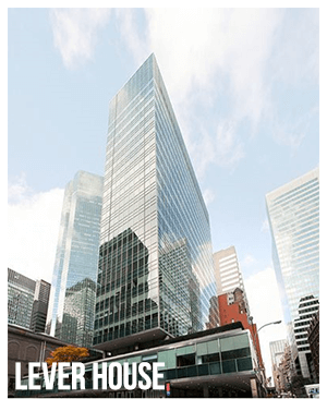
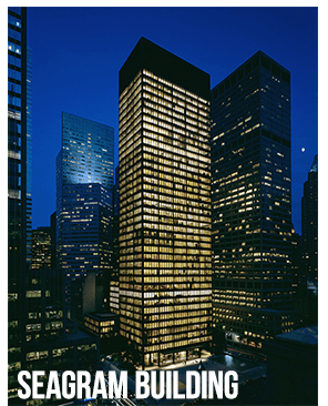
Photo credit: archdaily.com
The Lever House
The Lever House, located in Park Avenue Manhattan, New York City, was one of the first and best office buildings that used glass and steel curtain wall. The building is twenty-one storeys high which qualifies it as a mini skyscraper. It was originally the headquarters of the Lever Brothers soap company. The architectural project was designed by Gordon Bunshaft who was the chief designer from Skidmore, Owings and Merrill. It was completed in December 1951 and officially opened four months later. Due to age taking a toll on the building, it was restored a few years ago by the same company, not the Chief designer Gordon Bunshaft since he passed away earlier.
The lever house is a rectilinear and slab shaped tower. It is faced in reflective and elegant blue-green glass that entirely covers the north, south and east sides of the tower. The building looks like it has two forms visually, but in reality it’s physically integrated. The vertical form, being the tower and the horizontal form, which is the base and part of the plaza looks like they are stacked on each other, but they are actually balanced. The rectangular columns that are sheathed in stainless steel supports and raises the horizontal one storey second floor base off the ground, which provides space for the public plaza underneath that the building is entered from. The columns are purposely located along the perimeter of the base/plaza which leaves space for a courtyard in the centre. The columns’ lifting the horizontal base off the ground provides circulation and creates connectivity between the exterior and interior of the building. They create a sense of lightness and it even looks like it is hovering or floating above the ground plane. The horizontal base extending towards the city is the largest floor which contains office facilities, lounge for workers and a medical suite. A terrace and the workers cafeteria were located in the third floor while offices were located all the way up to the twenty first floor where the penthouse suite is also located.
Click here to find out the "six best architectural software programs to learn"
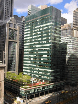
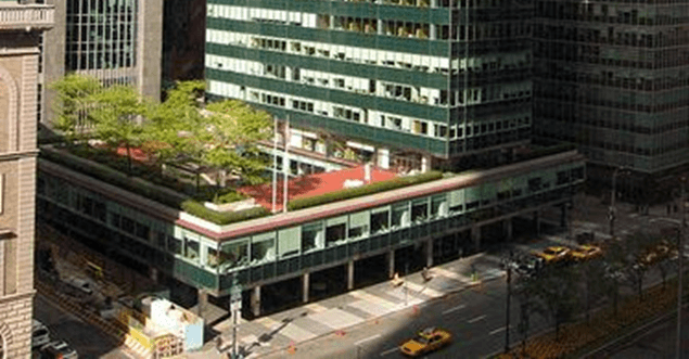
Photo credit: archdaily.com
The curtain wall made of stainless steel and heat resistant glass is one of the significant design elements of the building. The design has an aesthetic form and is also economically functional. It would be simple to clean and preserve its reflectivity since the facade is all glass and it also plays a role in reducing the cooling costs. The curtain wall, which has no windows that operate, is entirely sealed to decrease noise pollution and also prevents dust, and dirt from entering the building from the city. Due to the building being sealed, fluorescent lighting and air conditioning were important in providing interior comfort. Rather than appearing enormous, the building appears voluminous due to the glass concealing the internal structure.
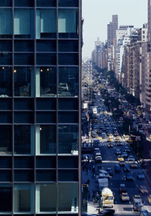
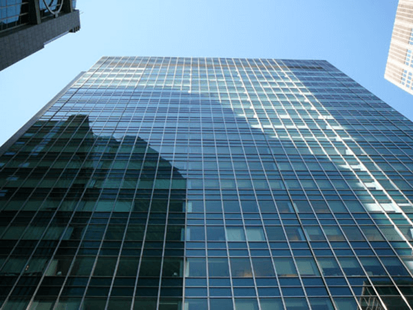
Photo credit: archdaily.com
A new architectural image for New York City business
The lever house gave Skidmore, Owings and Merrill’s reputation a huge boost. It received worldwide praise and recognition from critics and architects. It created a new architectural image for New York City business.
The Lever house created an innovative environment for work and according to the Business Week’s writers, as they entered the lobby; they described it as “hard to tell whether you’re in a modern office building or a resort hotel.”

Taking inspiration from the architectural design ideas of Mies van der Rohe
The Lever House reflects the German-American architect Mies van der Rohe’s ideas because the building is made of the glass and metal that was first pioneered in his buildings in Chicago. Bunshaft was heavily influenced by Mies’s continuous development of design and his expression of steel. Bunshaft said that a glass-walled tower “made companies and their offices look progressive. They no longer had to appear reliable and sturdy but could convey a sense of being on the move, being a part of the twentieth century”.
Nowadays when compared with New York’s high-rise buildings that are also made from steel and glass, the Lever House hardly qualifies as a skyscraper. It is now totally inundated and dwarfed by bigger buildings. However, when it was completed in 1952, the Lever House would have been striking to the eye because all the surrounding buildings were stone and brick faced. There was nothing quite like it and Lever house became a prototype of countless buildings in its country and possibly the world.
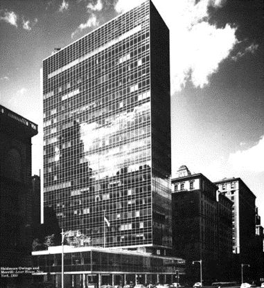
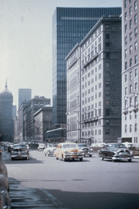
Photo credit: archdaily.com
The client, Charles Luckman, president of Lever Brothers and previously trained as an architect wanted to do something new. Luckman wanted a prominent building dedicated to the hundreds of Lever workers. He wanted a building that was innovative, stunning and looked fresh. Interestingly Lever was a soap company and his desires fit perfectly with Lever’s products. The building represents cleanliness and it just looks sharp, immaculate and precise. When the building was finished, the feeling of cleanliness and freshness would have been stronger at that time because the surrounding brick and stone buildings would have been thirty to forty years old.
Seagram Building
The Seagram building, located on 52nd street/375 Park Avenue Manhattan, New York City, was designed by Mies van der Rohe for the Canadian multinational Joseph E Seagram and Sons Corporation. Seagram was a successful liquor company and was possibly the world’s largest liquor company at that time. The building was built between 1954 to 1958 and is 38 storeys high. It was the first building in the world with floor to ceiling glass walls. Prior to this building, Mies had been designing these types of buildings but never had an opportunity to build an office building. The Seagram was his first expedition into the high-rise office building construction and it gave him an opportunity to see his long-awaited ideas.
The Seagram building is setback around 28 metres from the Park Avenue building line which creates a large plaza in front of the entrance. This produces room for the two large fountains, pools and outdoor seating. Setting back the building differentiates it from neighbouring buildings. Its form is relatively simple. Just like the Lever House, it is a rectilinear and slab shaped tower that has a sense of cleanliness, transparency and reflection. Its volume gives a sense of geometric unity. The building’s curtain wall of bronze and bronze tinted glass facade exemplifies elegance and modernism.
It is apparent that this building expresses Mies’s mystic faith in structure as the basis of architecture. The curtain wall projects from the seven-metre-high first floor slab to the top of the tower. This gives an impression and sense of discipline and generosity. The bronze and black colour is quite subtle having a finish just like what a sculpture would have.
Influenced by Greek and Roman Architecture
Mies was heavily interested in Greek and Roman architecture, and this was apparent in this building. Just like Greek architecture, the form of this building is very symmetrical and it has a classic sense of proportion. Mies created and reproduced a model of Park Avenue on an elevated table. The elevated table allowed him to view the model at eye level. This helped him achieve the perfect proportions of the Seagram building and its plaza relative to the street. The columns across the front of the building have somewhat shallow vertical grooves or striations. This makes the columns look fluted just like the pillars on the Parthenon. The structural columns are set 27 feet, nine inches apart in both directions, to form a classical ratio of five bays wide by three bays deep. The base of the building is also on a stepped platform similar to a Greek stylobate.
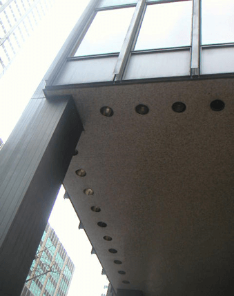
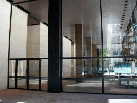
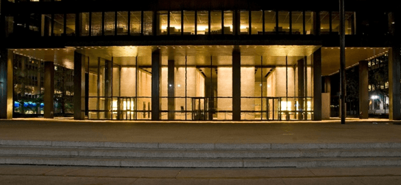
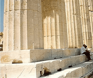
Photo credit: archdaily.com
Looking up at the building from the ground there is a sense of vertical velocity. It looks like it is soaring upwards. The vertical mullions that are between the window bays project from the base to the top without any interruption. This exaggerates these senses and visuals. The mullions have no function other than aesthetics. In contrast with the classical Greek Ionic pillar, the mullions or I beams enliven the building’s facade with light and shadow. They are simply decorative that adds texture, shallow depth and a sense of density to the facade of the building. These characteristics could also be compared to the Parthenon since it was also decorated.

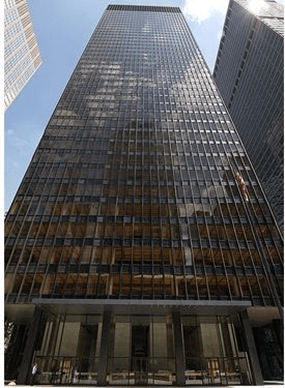
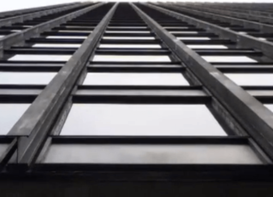
Photo credit: archdaily.com
The attention to detail is apparent in the building’s materials. The mosaics, granite floor slabs, marble and bronze castings for the columns, and the bronze/amber-grey glass exterior has been beautifully used along with the gorgeous reflecting symmetrical pair of fountains and pools at the front of the tower. The elevator shafts wrapped in travertine in the lobby visually solidify and supports the building’s interior. Mies has again referenced antiquity because this is Roman Travertine. This building was very expensive in its time not only due to its materials, but the land it occupies, which is Manhattan’s business area. The building cost was 36 million along with the land costing 5 million.
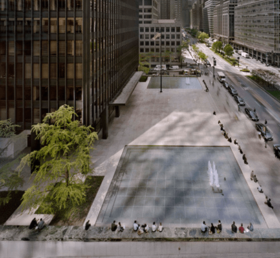
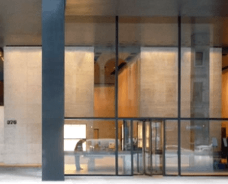
Photo credit: archdaily.com
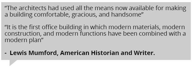
The Seagram building is seen as one of the classic twentieth century skyscraper and is a modern architectural icon in New York. William Jordy, whom was a critic, noted that the bronze Seagram building was “the first metal and glass skyscraper consciously designed to age as masonry buildings age – as appropriate for Seagram’s whisky as sheen for Lever’s soap” . The building set a standard for modern skyscrapers and it became prototypical for numerous high-rise buildings on Park Avenue, and Sixth Avenue. Mies would also use the Seagram building as a prototype for the variety of office buildings that he would subsequently build over the next ten years. He received further commissions in Chicago at the end of the fifties and onwards. This essentially transformed the city visually, as a result of Mies exploring the skyscraper theme which was first proposed in New York.
The Lever House and the Seagram building were ahead of its time in the 20th century
The neighbouring buildings both created a fresh architectural image for New York. At the time when they were completed, it would have been amazing to see since its surrounding buildings were masonry. The two modern iconic and influential towers are seen as classic twentieth century skyscrapers. Both buildings set a standard and became prototypes for many office buildings not only in New York, but also around the world. They were both innovative buildings that used modern materials and modern construction. Being balanced and strict in geometry, they also exemplify elegance and beauty throughout their materials. Even though both buildings are dwarfed by much larger buildings in New York today, visitors are still mesmerized and admire the aesthetics of both buildings.
Both buildings were the first of its kind. Around the fifties which was the time both buildings were built, Gordon Bunshaft said “it was a time when thin skin was in the air,” with architects trying to get away from heaviness and masonry surfaces for aesthetic reasons and because lighter-weight buildings were less expensive to build. The Lever House was one of the first true office buildings that used curtain wall. The first building that used curtain wall was the United Nations Secretariat Building that was built just before the Lever House. Historian and writer, Lewis Mumford, noted that the Lever House was “the first office building in which modern materials, modern construction, and modern functions have been combined with a modern plan” .
The Seagram was the first building in the world with floor to ceiling glass walls . According to critic William Jordy, the Seagram building was “the first metal and glass skyscraper consciously designed to age as masonry buildings age – as appropriate for Seagram’s whisky as sheen for Lever’s soap”. Gordon Bunshaft said that glass-walled towers “made companies and their offices look progressive. They no longer had to appear reliable, sturdy, but could convey a sense of being on the move, being a part of the twentieth century”. It was no doubt that Seagram and Lever house were ahead of the conventional and set a trend toward technical excellence and precision as an aesthetic ideal. Both buildings presented the movement towards changing New York City’s zoning regulations. It now favours high rise buildings with straight sides and a piazza, instead of the earlier setback designs. It provided future clients with an assurance of implementing these ideas on their own.

The Seagram Building – not as innovative as we thought?
Despite being more on an avant-garde or an innovative position at the time, we can also argue that the Seagram building was possibly on an arrière-garde position. As stated earlier in the article, Mies was heavily interested in Greek and Roman architecture. Rather than using modern and new techniques in the Seagram’s construction and aesthetics, he applied ancient methods that were behind and obsolete. Regardless of the Seagram building’s height and size in contrast to the smaller scaled Roman and Greek buildings, it could be heavily compared to the buildings of the ancient Romans and Greeks. Mies was always referencing antiquity throughout his building. For instance, the classic sense of proportion, the mullions that serves no purpose other than decoration and somewhat resembles the Greek Ionic column, the use of Roman Travertine wrapping the elevator shafts, the slightly fluted and placed in a classical ratio of five bays wide by three bays deep columns, and also the stepped platform that the building sits on, referencing the stylobate of the Parthenon. Mies had posed himself a challenge and found an excellent solution in applying the lessons of antiquity in a modern building that’s made from metal and glass. He made an industrial culture and industrial materials relate to ancient buildings that are a couple of thousand years old made from classic masonry. Modernism was always searching for discipline and balancing the old and new techniques, creating something extraordinary and fresh.